- by colorful_fuse |
- Painting And Drawing
- | Submitted on 11/12/2008 |
- Skip
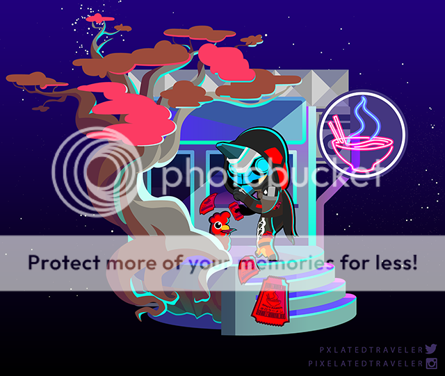
- Title: dark and light
- Artist: colorful_fuse
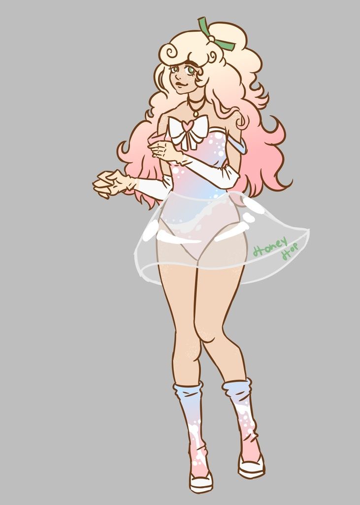
- Description: I enjoy playing with colors on paint but sometimes all the pic needs is some light!XD
- Date: 11/12/2008
- Tags: dark light
- Report Post
Comments (7 Comments)
- Nemena - 11/08/2009
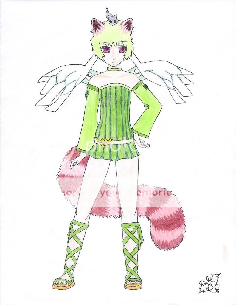
- Wow!!! Ilove the coloring and the ribboned socks too!!!(^.^)
- Report As Spam
- chi-eah - 11/16/2008
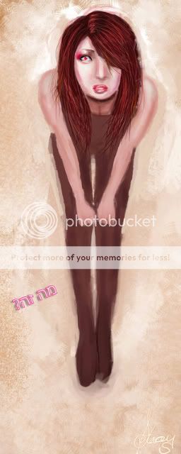
- I don't really understand what the portrait is supposed to be about. The top looks awkward, and the sleeve is a bit difficult to see. Aside from those things, I did like the colour scheme. The characters hair and face are my favorite part of the painting. Overall, this is not a bad painting, could use some improvements, but it's very good.
- Report As Spam
- xlight_X_darkx - 11/15/2008
- this is the best drawing i ever saw!!!!
- Report As Spam
- RestlessPencil - 11/12/2008
- nice composition, and an intresting character design. But if there was somethings i had to nitpick about is that the image is very blurry and can make the picture really hard to make out. i would like you to use more shading on the clothing because it comes out flat and can confuse people about where the sleeve ends and where the skirt begins. overall i think its a good job. keep up the good work
- Report As Spam
- riddel kid - 11/12/2008
- that is soooooooooooooooooooo nice it just looks soooooooooo good, love it!!!!!!!!!!!! have you drawn alot before? are the rest of them as good as this one any way i reallllyyyy like it you should become an artist smile <3 smile !!!!!!!!!!!!!!
- Report As Spam
- Claw of the Summers Sun - 11/12/2008
- nice, i really like it, 5 stars
- Report As Spam
- chelsealdy - 11/12/2008
- It's good but u need to work on the body proportion a bit.
- Report As Spam


